For most of its life, GraphCompose could lay out text and structure very well, and draw very little. It produced invoices, reports, CVs, and proposals — documents that are mostly typography, spacing, and tables. That was the point. But real business documents are not only words. They have a revenue chart, a sparkline next to a KPI, a logo, a divider shape, a coloured panel with a soft gradient. Up to now, every one of those meant rasterizing an image somewhere else and pasting it in.
The 1.8 release — I called it illustrative — is about closing that gap. The engine can now draw, and it draws the same way it lays out text: declaratively, deterministically, and as native vector geometry rather than pasted pixels.
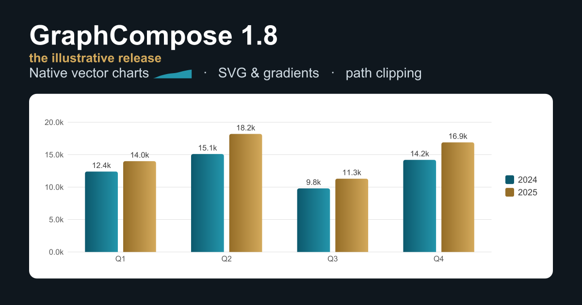
The banner at the top of this post is the honest version of that claim. It is not a design mockup. It is a GraphCompose page, rendered by the engine, then turned into a PNG. The bars carry real linear gradients, the little trend mark after “Native vector charts” is an inline sparkline, and the whole thing is the same code path any document uses.
Charts should belong to the document
The easy way to add charts to a PDF library is to depend on a charting toolkit, render a PNG, and drop the image on the page. It works, and it is wrong for this engine. A rasterized chart does not scale, does not match the document’s fonts and colours, and does not survive being measured and paginated like everything else.
So charts in 1.8 are part of the document model, not guests in it. You describe the data and the shape you want — a grouped bar chart, a line, a pie or donut — and the engine compiles that description, at layout time, into the primitives it already knows: shapes, lines, paragraphs. There is no chart-specific rendering code in the backend. A chart is measured, split, and placed by the same machinery as a paragraph, which means it is deterministic and testable by the same snapshot tests as the rest of the page.
That decision paid off in a way I did not fully expect. Because a chart is just primitives, the semantic export backend — which has no layout pass at all — can fall back to the chart’s underlying data table instead of failing. The chart degrades to its data, not to a broken page.
Smooth, but honest about the data
The part I am most quietly proud of is the smallest. A line chart can be drawn straight, or smoothed into a curve. The usual smoothing — a Catmull-Rom spline — looks lovely and lies a little: on a sharp swing it overshoots, bulging past the highest point in the data to a value that was never there. For a decorative chart, nobody cares. For a financial chart, that is a misrepresentation.
So 1.8 adds a monotone interpolation mode that stays just as smooth but is mathematically constrained never to leave the range of the points it connects. The curve cannot claim a number the data never had. It is one enum on the line spec, and it is the kind of detail that only matters to the small group of people it matters to a great deal.
Inline sparklines came along the same way: a mini trend silhouette that sits on a text baseline, next to a KPI or inside a CV line, smoothed with the same curve the charts use.
Importing the design world
The other half of illustrative is letting real artwork in. GraphCompose can now parse the practical subset of an SVG file — paths, basic shapes, grouped transforms, stroke and fill styling — and lower it into native PDF curves. An icon’s path data renders as actual Bézier geometry, smooth at any zoom, not a tessellated approximation. And gradients defined in that SVG — linear and radial, on fills and strokes — render as native PDF shadings with the exact endpoints, rather than collapsing to a flat colour.
Underneath all of it is one new idea: a vector path primitive, the open, curve-capable sibling of the polygon the charts already used. Smooth chart lines, decorative shapes you author by hand, and imported SVG icons all ride that single primitive. There is one source of truth for “a native curve on the page,” and everything that draws a curve goes through it. A new path-shaped clip outline lets a container mask its children to any silhouette — turn a logo into a content mask, fill and stroke along an arbitrary curve.
I want to be precise about the status, because it is easy to oversell an SVG importer. The path importer is solid; the whole-file reader is marked beta while it hardens against the strange things real exporters emit. And some things are deliberately out of scope — SVG text, embedded images, filters, masks, clip paths. The reader does not try to render those badly; it drops them with a single warning that names exactly what it skipped and why. I would rather it fail loudly and tell you than produce a document that is subtly wrong. That instinct — that a document you cannot trust is worse than one that refuses — runs through the whole engine, and I wrote about why in Documents Are Backend Infrastructure.
Keeping things together
Not every feature in 1.8 is about drawing. The one I reach for most is keepTogether() — an opt-in flag that says “if this block does not fit in the space left on the page, move the whole thing to the next page instead of splitting it.” A chart card, a signature block, a small table with its heading: things that look broken when a page break lands in the middle of them.
This is the unglamorous heart of a document engine. Pagination is where templates that looked perfect with demo data fall apart on real data, and giving authors one clear, declarative way to say “do not break this here” removes a whole category of those failures. It is the same lesson I keep relearning: layout is product behaviour, not decoration. Lessons from Building a Java PDF Engine is the longer version of that story.
A lighter download
One change in 1.8 you will feel before you write a line of code: the bundled fonts moved out of the engine jar into their own independently-versioned artifact. The engine no longer ships several megabytes of typefaces you may not use. If you want the curated font set, you add one dependency; if you bring your own, you do not pay for theirs. The core document APIs stay source- and binary-compatible with 1.7, so the upgrade is the two consumption changes — the fonts split and a removed config loader — and nothing in your templates.
The principle underneath
If there is a thread through all of this, it is restraint about the hot path. Charts, gradients, sparklines, imported icons, path clips — none of them added a new rendering handler to the engine. Every one compiles down to primitives that already existed, so the layout and render code that runs on every page did not grow. Documents that do not use a gradient produce byte-for-byte the same output they did before.
That is the trade-off I keep choosing: do the hard, clever work at composition time, where it happens once and can be tested, and keep the part that runs on every page boring. New things to draw, the same engine drawing them.
The release is on JitPack, and the changelog has the exhaustive list. But the short version is the banner: the documents can draw now, and they draw in vectors.